arrow-circle-down arrow-circle-left arrow-circle-up arrow-down arrow-left arrow-line-right arrow-right arrow-up ballon close facebook filter glass lock menu phone play point q question search target twitter
X

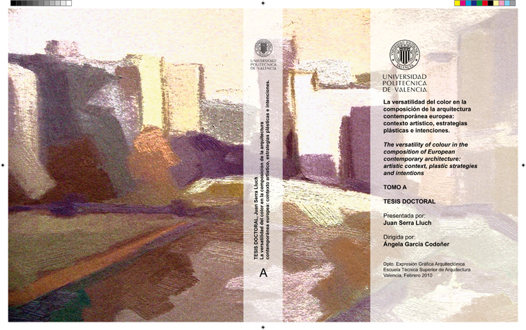
La versatilidad del color en la composición de la arquitectura contemporánea europea:

Ficha   |     |   Descarga
Título: La versatilidad del color en la composición de la arquitectura contemporánea europea:
Subtítulo: contexto artístico, estrategias plásticas e intenciones
Autor: Juan Serra Lluch
Director tesis: Ángela García Codoñer
Centro de lectura: E.T.S. A - València - UPV
Fecha de publicación: 19/04/2010
Tipo de documento: text
Abstract en inglés:

                The colour is acquiring great importance in the design of contemporary architecture and seems to be overcome certain chromatic disinterest dragged from the period of modernity. Nevertheless, the discipline lacks a sufficient theoretical framework that addresses the color from a specifically architectural point of view, which allows to extend the creative possibilities, to properly assess the results and which redounds, definitively, to an improvement of the professional practice.

                Therefore, this research aims to understand and appreciate the circumstances, mechanisms and motivations that lead certain European renewed architects to use the color in such a conscious and innovative way. It is analyzed particularly the work with colour of Norman Foster, Sauerbruch & Hutton, EMBT Architects, Herzog & De Meuron, Gigon & Guyer, William Alsop, Jean Nouvel, MVRDV, as test cases that cover the major trends in color development of today.

                Relating to the circumstances, this paper carries out a historical analysis which provides an overview of the artistic context in which contemporary building and their chromatic composition systems are develop. These are understood by opposition and continuity with those of the modern and postmodern architecture of XXth century. During the modernity, three architects and chromatic systems stand out: Purism and Le Corbusier; expressionism and B. Taut, Neoplasticism and G.T. Rietveld. Postmodernity relies on a much more heterogeneous range of chromatic architectural systems and architects, that can be grouped around four trends: the new utopias, the enlightenment rationalism, the figurative postmodernism, and deconstruction.

                Mechanisms refer to the plastic possibilities that colour provides. The study can discern three key strategies: colour to interfere in the perception of the visual properties of the form (geometry, dimensions, visual weight or texture), color to interfere in the description of the architectural object (both composition and its function), and colour displayed because of its own chromatic intrinsic value. These three strategies summarize and supplement the models proposed by other authors and have served as a basis to analyze the different samples of architecture with colour studied.

                The motivations are the intentions expressed by the architects and those that encourage their chromatic dispositions. This study demonstrates that there are two main intentions: to arrange a very versatile colour arrangement, and to manifest the creative freedom of one’s own architect. The versatility of color refers to a change in appearance of the architecture (chromatic transformation), a change in its entirety (chromatic fragmentation), a change in its position (chromatic motion) or a change in its procedures and technologies (chromatic innovation). The manifestation of the creative freedom is expressed through what we call “chromatic hedonism” of the architect, the transgression of modern compositional principles and other provocations.

                The present research concludes that the color in the contemporary European architecture evolves towards its versatility and pursues a much more freedom and without prejudices, something that has been made possible by technological improvements in the design process and the appearance of new building materials. Paradoxically, the color in nowadays architecture has regained prominence without transgressing the Ruskinian will to express “the material truth”, as some formerly antagonistic concepts have become obsolete as the disjunction between “self colour” of material versus “pigmentation”.

Abstract en castellano:

                El color está adquiriendo mucha relevancia en el diseño de la arquitectura contemporánea y parece que se va superando cierto desinterés cromático arrastrado desde el periodo de la modernidad. Sin embargo, la disciplina carece de un cuerpo teórico suficiente que atienda al color desde un punto de vista específicamente arquitectónico, que permita ampliar las posibilidades creativas, valorar adecuadamente los resultados y que redunde, en definitiva, en una mejora de la práctica profesional.

                Por ello, la presente investigación tiene como objetivo comprender y valorar las circunstancias, mecanismos y motivaciones que llevan a determinados arquitectos del panorama actual europeo a emplear el color de una forma consciente y novedosa en la arquitectura. Se analiza particularmente la obra coloreada de Norman Foster, Sauerbruch & Hutton, EMBT arquitectes, Herzog & De Meuron, Gigon & Guyer, William Alsop, Jean Nouvel y MVRDV, como casos tipo que cubren las principales tendencias cromáticas de hoy en día.

                En cuanto a las circunstancias, este trabajo realiza un repaso histórico que proporciona una visión global del contexto artístico en que se desarrollan las obras contemporáneas y sus sistemas de composición cromática, que se entienden por oposición y continuidad con los de la arquitectura moderna y postmoderna del s. XX. Durante la modernidad destacan tres arquitectos y sistemas cromáticos: el Purismo y Le Corbusier; el Expresionismo y B. Taut; el Neoplasticismo y G.T. Rietveld. La postmodernidad cuenta con arquitectos y sistemas cromáticos mucho más heterogéneos que pueden ser agrupados en torno a cuatro tendencias: las nuevas utopías, el racionalismo iluminista, la postmodernidad figurativa, y la deconstrucción.

                Por mecanismos cromáticos entendemos las estrategias plásticas que el color posibilita. El estudio permite deducir tres estrategias fundamentales: el color para interferir en la percepción de las propiedades visuales de la forma (su geometría, dimensiones, peso visual o textura), el color para interferir en la descripción del objeto arquitectónico (tanto su composición como su función), y el color por su valor cromático intrínseco. Estas tres estrategias compendian y completan los modelos propuestos por otros autores y han servido como base para analizar los ejemplos de arquitectura coloreada estudiados.

                Las motivaciones son las intenciones manifestadas por los arquitectos y que alientan sus disposiciones de color. La investigación desarrollada demuestra que existen dos motivaciones principales: la de disponer un colorido muy versátil y la de manifestar la libertad creativa del propio arquitecto. La versatilidad del color se refiere a un cambio en el aspecto visual de la arquitectura (transformación cromática); a un cambio en su integridad (fragmentación cromática); a un cambio en su posición (movimiento cromático); o a un cambio en los procedimientos y tecnologías (novedad cromática). La manifestación de la libertad creativa se expresa por medio de lo que se ha denominado “hedonismo cromático” de los autores, la transgresión de los principios compositivos modernos y otro tipo de provocaciones.

                La presente investigación concluye que el color en la arquitectura contemporánea europea evoluciona hacia su versatilidad y persigue una expresión mucho más libre y sin prejuicios, algo que ha sido posible gracias a las mejoras tecnológicas en el diseño y la aparición de nuevos materiales de construcción. Paradójicamente, el color en la arquitectura ha recuperado protagonismo sin transgredir la voluntad Ruskiniana de expresar “la verdad material”, al quedar obsoletos conceptos antiguamente antagónicos como “color propio” del material versus “pigmentación”.

Tema materia: Arquitectura
Tipo contenido CD: Tesis